This is a music video I looked at before making my video. It is also from another underground London scene as it is garage. The editing is like ours in the fact that it is to the beat and fairly fast paste. The mise en scene of this video is also similar being filmed in rural London with people who are all dressed fairly retro wit hightops and funky haircuts. We used this video as the inspiration behind the idea of changing some of the colour of the shots.
Another video I looked at was Example's music video for 'Kickstarts'. This is the video where we got the idea for our grid of lips which he uses with feet at the start.
Again the costume is also similar in some way with high tops. I imagine these would be the people in our video by day when they have not been partying. This video also gave us our idea for our bubblegum shop as it was a fun and playful which we wanted to represent in our artist.
We also took the idea of him stamping out the shot which they have made work in editing. We have a shot like this in our video where our artist points to the ceiling and another sot falls onto her.
When looking a digipaks and adverts to influence my own I looked at mainly new upcoming artists who are fully established yet.
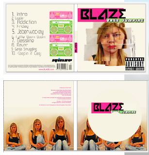
When I first found this album cover I looked at doing something similar with my artist however I wanted a close up on her face so still using lots of small photos of her face I put them together to make a big face. Example uses very big bold writing which I liked as I feel it sticks out and is easily recognisable as his album. I also made my artists name very big as I feel it is important for the album to stick out when being sold on a shelf.
The colours on examples album cover all complement each other and don't over complicate it. Some of his outfits can be found on him in his video which brings a link across from the video I tried to do the same making Sarahs lips red on the cover and her hair similar to some of the shots in the video.
I also looked at Florence and the machines digipak and advertisement together to look at how I could link my video, didgipak and advertisement effectively.
Looking at this we can see that she used the image from her album cover on her advert making a clear link, showing the product being sold. The artist name in the same font as on the album cover which is now iconic to Florence is at the very top of the advert and is in white which stands out on the black background and makes it easily recognisable. Taking all these ideas I used them on my advertisement making sure there was a clear link between my video, digipak and advertisement. To do this I ensured I took the photos with similar clothing and ensuring she had red lips. I used the same fonts, colours and images between the album and advertisement.
Another convention of our genre's music video is fast paste editing. We did try to do this however I do not think it was as fast as it should be at some points in the video such as the build up to the drop. If we had more time we would have been able to perfect this but unfortunately due to the amount of time we spent experimenting with different types of edit on each shot we ran out of time.


No comments:
Post a Comment