Showing posts with label Lauren Ackie. Show all posts

Friday, 21 January 2011

Evaluation - Question 4

The feedback that was recieved at the pictures was svery possisitive, all the people who gave feedback liked it obviously nothing is perfect and they all had things that we could improve on, none of the being major.  


Feedback one


From this feedback it is clear that the things she thought could of been improved were having more people in the video, this may be because people got bored of looking just one person. But as a group we personally thought that having one person in the video was the right thing to do as it focused on one person; the artist, as she was the main focuss of the song.

Feedback Two


From this feedback the thing he thought who could of been improved was the lip syncing, some was out of sync. After looking carefully at the video i noticed that the bit of footage that was out of sync by just a tiny bit was the part of the grid with the lips saying louder. We did work really hard on trying to sync up the video and sound perfectly, the grid was a really complicated thing to do. 

I choose to look at these two peices of feedback in particular as they were the once that were most honest about the things that wasn't quite right and needed improvement. Things that wasn't mentioned for good or bad which mean they wasn't pefect enough. Were the amount of shots that were featured in the video, and now looking back i think that maby we could of included different kind of shots that we would of put effects on. From the feedback i think it is aparent that the editing and effects were done really well and didnt need imporving. The editing to the beat was really good and kept the pace of the video, which fitted in with the genre conventions.

In my opinion i think the video is really good but its not the way that i imagined, i imagined it to have alot more effects but the time wehad to create the music video there wasn't enough time. One aspect of the video that was well recieved was the panel grid with the lips, i also really like this element of the video, it was the one ideas that we had that was kept the same throughout the process of planning and filming and it is one of my favourite parts of the video along with the bit where Sarah is dancing and we put a flashing effect on it. One thing that was praised was our editing and effects, we put colour glows on alot of our clips and changed the speed.

Evaluation - Question 3

Throughout the project, we were introduced to a number of new media technologies. A lot of them i have used before but with this project it allowed me to use it further my knowledge on the technology. 


To film the music video we used brand new state of the art cameras, we used them when filming the opening to thrillers last year but this year, the cameras were handled a lot more as it was important to have a number of different shots for the music video to make editing easier.  When filming it was very important to make sure the cameras were in focus as failing to do this would leave the clips distorted. 


Blogger was a big part of documenting the process of the music video and print products, blogger helped to keep track of all the research we had done for the music video. Here is blog of the anamatic that myself and my group made, when coming to film shots for the actual music video it was very helpful to look back on. It is really easy to use blogger, you simply type in the web address which is http://www.blogger.com/ in the search tool then put in the user name and password, scroll down to the group you are in. All the blogs for your group are in the same place each under the persons name, to publish a post youc click new post, write what you want and when you are done simply press publish and it will appear on your groups homepage. You can review your old blogs and change them if needed.
http://candipop10group27.blogspot.com/2010/10/anamatic.html


Link to the anamatic http://candipop10group27.blogspot.com/2010/10/anamatic.html


I used internet to research, things about the genre. I used youtube the most, to find videos that inspired myself and my group. We new that we wanted to have a grid panel in this video if something and I new that Examples video for kickstart featured a lot of grids so on youtube we watched the video and thats where we came up with the idea to have a grid for the lips. Relating to genre we searched artists that were the same genre as our song, M.I.A was a big influence influence to us regarding wardrobe and her video Bucky Dun Gun made a big impact with the colour flashes. We used youtube to search for these videos and used related videos to view other music videos of the same genre. 


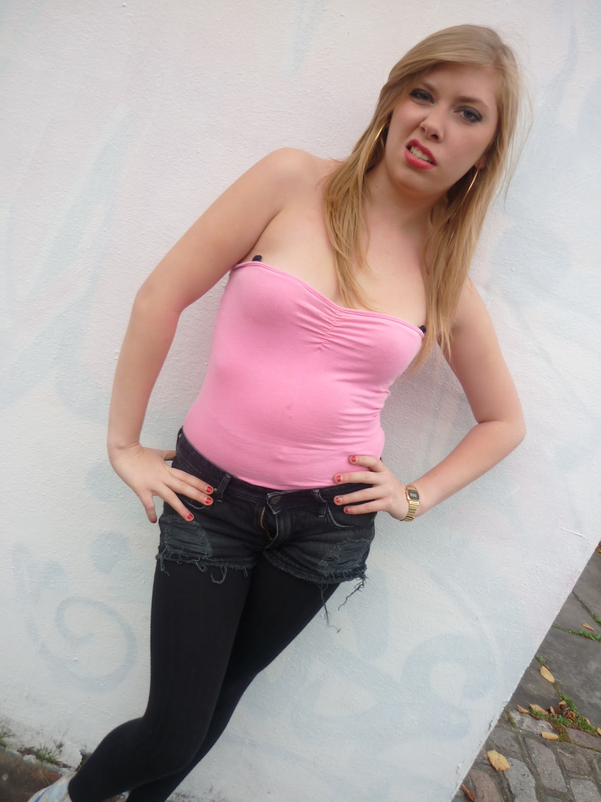
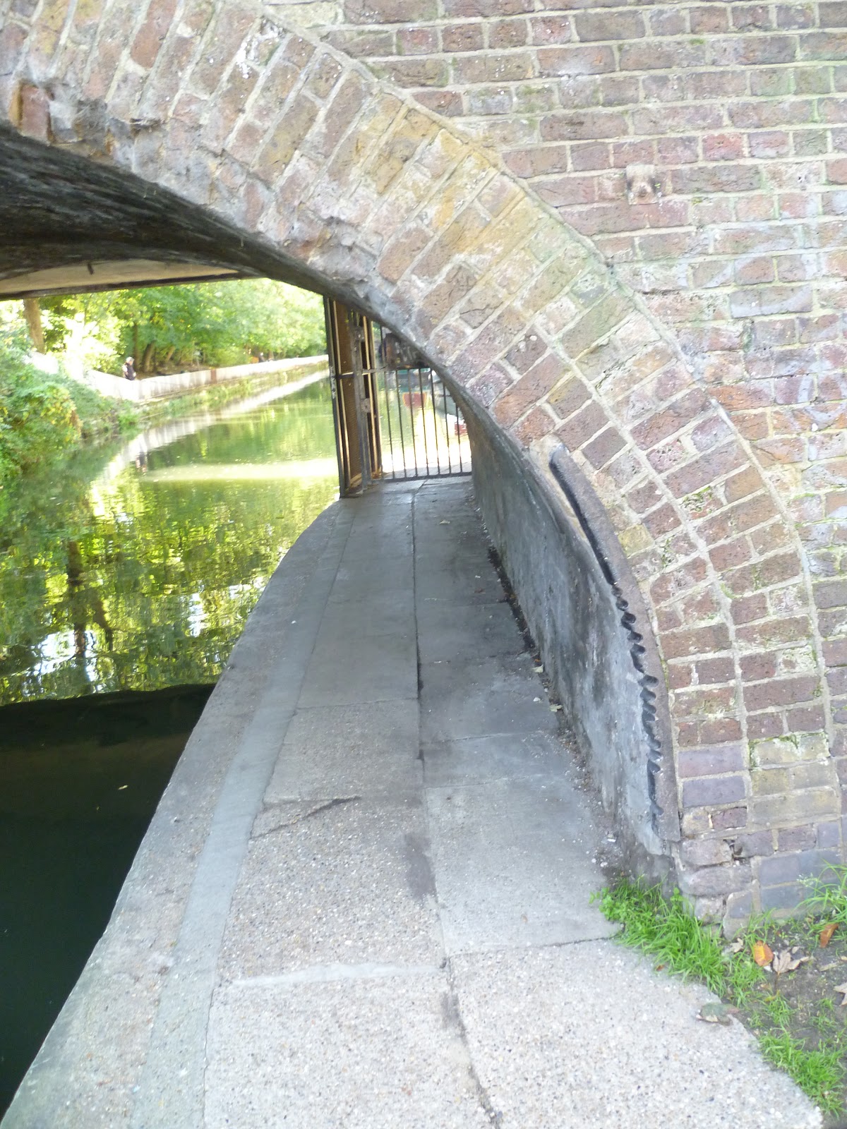
Myself and my group didnt use the green screen, most of our footage was filmed outside either on a plain white wall, under a tunnel and infront of the graffiti sitting on a wall. We was originally going to sue the green screen for a white background, but as we needed to change it white it would of been difficult to cut it out and Sarah would of ended up with a green halo round her head. Which wouldn't of looked good at all.

We made an anamtic before we started filming, we took some photographs of Sarah in some of the shots she would be doing while filming. We didnt stick to the exact same thing as what was in teh anamatic as when it came to filming our  ideas were developing and we decided to change the bit with the traffic withch would have been featured when the chorus was on to the smoking and dancing which was there in the final edit. Creating the anamatic was really easy once we had taken pictures, we put the mp3 of the track - Louder in final cut along with the pictures and it was just a matter of putting the pictures where the shots were going to be in the final music video.


To create my digipak and advert i used photoshop. In class we were shown an introduciton to both photoshop and quark which showed us how to use both programmes properly, after the introduction i decided that i wanetd to use photoshop to create my print products as i found it easier to use and i have used photoshop before so i was more familer with the tools. We were given a template for the digipak which was optional for us to use, i decided to use it so i new exactly where each panel of the digipak was. Once your images are in photoshop it is easy to play about with them and put on different effects on. As i wanted there to be a white brick across the whole of my digipak, i had to make the picture of the wall transparent and lay pictures on top of it so it looked like the image was taken with the wll in the background.


Wednesday, 19 January 2011

Evaluation - question 1

Question 1 


Evaluation - Question 2

My Digipak 


My Advert 


Both my advert and digipak have strong links with my music video, throughout my music video there is a recurring theme of lips which is also portrayed in my advert and digipak, I chose to make lips a key aspect to both my digipak and advert as it heavily featured in then music video.


screen shot from music video                                                                             


It was important to choose and artist that reflected both the genre of the song and the music video itself. The artist's name my self and my group chose was Blaze. We felt this fitted perfectly with the genre, sub genres and music video and most importantly that image. The word blaze is also featured in the video when the artist is sitting on the wall, the word blaze is graffitied on the wall behind her. 

Screen shot from music video


For the images used on my digipak I wanted them to be simple, as the shots of the "Blaze" featured in the music video were simple I felt this would best fit in with the media conventions. I took one picture form the video, which was used behind the pannel for the disk. The other image I took, up against a white wall. The background had to be white as i put a white brick wall behind the image. The images of the lips i got form google, i chose to use an image from youtube rather than take one or take one from the video because i felt they looked better on the digipak and advert. 


Screen shot from music video 


 I think it is really for the audience to recognise a strong link between the music video and both the print products, it is easy to create a link between the three products. To do this i had to make sure all products fitted in with the genre conventions and follow a theme which i successfully achieved. The clear links are the recurring lips, and the name of the artist which is featured in all three products. I used the same fonts, colours and sizes for the fonts for both print products, to continue the theme. I think both my main and ancillary texts are successful They both relate strongly with the music video, they both convey an image for the artist and get the information across clearly.  I think the target audience would be attracted to them, the colours are very bright and the images are very attention grabbing.

Thursday, 6 January 2011

Do's and Don'ts

Before starting my digipak and advert it is important that I am clear on the do's and don't, to ensure that I produce a good digipak and advert. 

Do's 
  • Use a font that is easy to read
  • Make sure the colour of the font is not to light to be read
  • Use photos that are in clear focus
  • Follow the 3 colour rule
  • Use font that follows the conventions of the genre of the music video 
  • Use appropriate size for images and fonts
  • Think carefully where you place the font 
Don'ts 
  • Enlarge photos using strech 
  • Forget to put artist name on the spine 
  • Place text across artist face
  • Use any font, use one thats fits with the genre 

Photo's i plan to use for my Digipak and Advert

These are the images I plan to use for my digipak and advert.


Ideas for advertisment

This is a very basic idea for my advertisment, once again like the digipak i have chosen to feature lips on my advertisment. The artist name will once again be in graffiti writting across the middle of the advert. I will also use the white brick wall for the background of the advert so there is a consistancy throughout the digipak and advert. The information that i will have on there will be simple, the featured songs, the day the album is realsed, how many stars it has been awarded and record lable.


Ideas for digipak

These are the ideas for my digipak they are quite simple, they feature the artist 'Blaze' posing on the floor infront of a white brick wall which runs throught the intire digipak as a back drop. The artist name will be written in graffiti writting and will tile the centre of the front cover of the digipak. On the left side of the back cover there will be three pictures of lips, lips is a huge part of the music video that was used a number of times throughout.

The inside cover is also very simple with the white brick wall running through and a screen shot from the music video of the artist smoking, which will be on the side where the CD will go. As the shots in the music video are simple I am going to keep my digipak the same. Having the artist smoking and the white brick wall gives a young urban feel to the digipak which the genre of the music video is.  

Front and back cover                       Inside
 

Analysis of advertisments

                                                              Rhiana - Loud

Digipak cover                                   Advertisment


The is a very close link with the advertisment for Rhiana's album Loud advertisment and the digipak cover . There is a continuious theme with the colour red carried out through both the advert and cover. The advetisment doesnt contain alot of information about when the album is being released, record lable, ratings and dates of any tours she may be doing. The digipak cover is also very simple with only the album name and a picture of Rhiana herself. By using the theme of red throughout the digipak and advertisment it is very easy to tell that the two go together.


Analysis of different digipaks

To help me to develpe my digipack I found it very beneficial to look at artists music videos and see how they relate to there digipacks.


MGMT 

The front cover from the MGMT self named album digipak cover is very simple. There is a strong link with the digipack cover and images that are featured in there music videos. The MGMT album and music videos all follow a theme. The background of the digipac is featured throughout the music video for Time To Pretend, being the first song realised from the album its a great way to engage audiences and is easily recognisable.


Nicki Minaj - Pink Friday

As you can see the front cover of Nicki Minaj's digipak it is very pink, hense the name of the album Pink Friday. Throughout this music video - Check It Out the artist is seen as a barbie, which is also seen in the digipak with her pink hair and lipstick.


Example - Won't Go Quietly


It is clear that the image for the digipak was inspired by the music video kickstart, from the beginning of the music video there are a number of grides used that feature the artist - Example. I think the general idea of using grids looks really good on any type of music video and to reflect them onto the album cover is a good idea. The different images in the grids show the diffferent elements of both the artist and albums traits.


Potential fonts for digipak and advertisement

I look at different types on fonts that could feature on my digipak and advertisement. I was looking for graffiti types writing as that would fit in perfectly with the genre. I will be using the font for the artist name so what i was looking had to sand out and have a big impact on the digipak and advertisement.  I have chosen three that i really like and i will use atleast one of them to go on my digipak and advertisement. 


Wednesday, 5 January 2011

Feedback for music video - Louder


It is clear from the feedback that our music video fitted in very well with the genre of the song and matched the niche urban audience. From the feedback that was gathered the improvements that could be made are very minor and were more about the performance than the editing and filming of the video.

Friday, 22 October 2010

Shots for potential locations

part of the music video will feature sarah standing in under the tunnel at the Islington Canale


Most of our shots are going to be shot against a white wall or the green screen. 

Anamatic

Final Song Choice

Katy B - Louder


Our final song choice is Katy B - Louder, our video is going to be very different from the original, it will have no narrative and will be vastly edited. Unlike the original that just sees the artist walking around various locations out video is going to be filmed against the green screen and a white wall focussing on the artists image and the way the video is edited.